How to Fix Flat Shading in Pyrography Portraits | Phoenix Pyrography
 Kez Halliday
Struggling with flat shading in pyrography? Learn realistic woodburning techniques for portraits of pets & people. Burn with confidence.
How to Fix Flat Shading in Pyrography Portraits
If you’ve ever stepped back from your burn and thought, “Why does my portrait look flat like a cardboard cutout instead of a living, breathing face (or fluffy pup)?” You’re not alone.
Flat shading is one of the biggest challenges in realistic pyrography, especially when you’re working on a family member or pet portraits where every detail matters. The good news? Flat shading isn’t permanent, and with a few shifts in technique, you can bring depth, softness, and life back into your work.
At Phoenix Pyrography, I’m here to help you Burn With Confidence, so let’s walk through this together.
Step 1: Understand What’s Missing
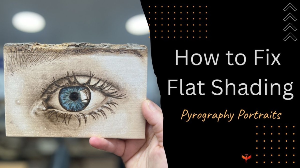
Flat shading happens when your burn is too even. Instead of a soft transition from light to dark, you’ve created a single “block” of tone. It’s like colouring with one shade of pencil it’ll always look flat.
In portraits, this can make cheeks look “pasted on,” fur look like painted straw, or eyes lack their natural sparkle.
What’s missing is value variation those soft transitions that mimic the way light wraps around form.
Step 2: Study the Light
Grab your reference photo. Don’t just look at what you’re burning as a whole (an eye, an ear, a cheek). Instead I want you to look at the light source.
-
Where is the brightest highlight?
-
Where is the darkest shadow?
-
What soft mid-tones bridge the two?
Tip: Squint your eyes at the photo. This blurs the details and makes values (lights and darks) easier to spot. These Values are super important.
Step 3: Layer, Don’t Block
Instead of filling in with one flat burn, build up your tones gradually. Think of shading like stacking layers:
-
Start with the lightest tone you see.
-
Add another pass, slightly darker, in the areas that need depth.
-
Keep layering until your darkest shadows emerge naturally.
This creates soft gradients and avoids harsh “colouring-book” shading.
Step 4: Use the Right Nibs for Realism
Your choice of pen tip makes a huge difference:
-
Rounded shader → perfect for soft transitions on skin or fur.
-
Spear shader → smooth blending over larger areas.
Spear shader → great a starter shader.
-
Skew tip → crisp details for hair, whiskers, and fine fur.
Switching between your preferred nibs, helps you balance soft shading with realistic detail.
Step 5: Add Depth with Contrast
Flatness often happens when the range of tones is too narrow. Don’t be afraid of your darks!
- In pet portraits, the shadows under a chin or in the corners of the eyes give shape and realism.
- In people portraits, the darker edges of nostrils, lips, and hairlines make faces feel three-dimensional.
Push your darks where they belong, and the highlights will pop.
Step 6: Step Back & Evaluate
Sometimes we’re so close to the wood we miss what’s happening. Hold your piece at arm’s length, go and make a cup of tea, or even snap a black-and-white photo of it. This helps you see whether the shading truly has depth or if it’s drifting toward flat again.
Quick Win for Today
If your shading looks flat, don’t panic. Take your favourite shader, drop the heat slightly, and add gentle overlapping strokes in the mid-tone areas. This layering trick instantly adds depth without over-darkening.
Final Thoughts
Flat shading isn’t a failure it’s just a stage, and you can learn to see and build values. Every artist goes through it. With patience, layers, and an eye for contrast, your portraits of family members and beloved pets will gain the lifelike quality you’re aiming for.
Remember: you can Burn With Confidence.
If you’d like guided tutorials, shading demonstrations, and step-by-step pet portrait workshops, you’ll find them inside the Phoenix Membership.